Survival analysis involves the use of data which measures the time to an ‘event’. In the context of cancer, the event could be death and the survival data might record time from cancer diagnosis to death.
Other survival events of interest can include:
Time until disease recurrence
Time to re-hospitalisation following discharge
Progression-free survival
Time to treatment failure
Survival data are concerned with recording the length of time for a patient to reach the specific endpoint, rather than simply recording whether the endpoint was reached. It therefore involves two variables – time to the event and whether the event occurred.
12.2 Censoring
One problem with survival data is that there is often incomplete follow-up for patients. This is known as censoring.
Censoring arises when:
A study is finished before all patients experience the event (which could be death)
Patients have to be excluded from the study due to other reasons (migration, lost to follow-up, other adverse event)
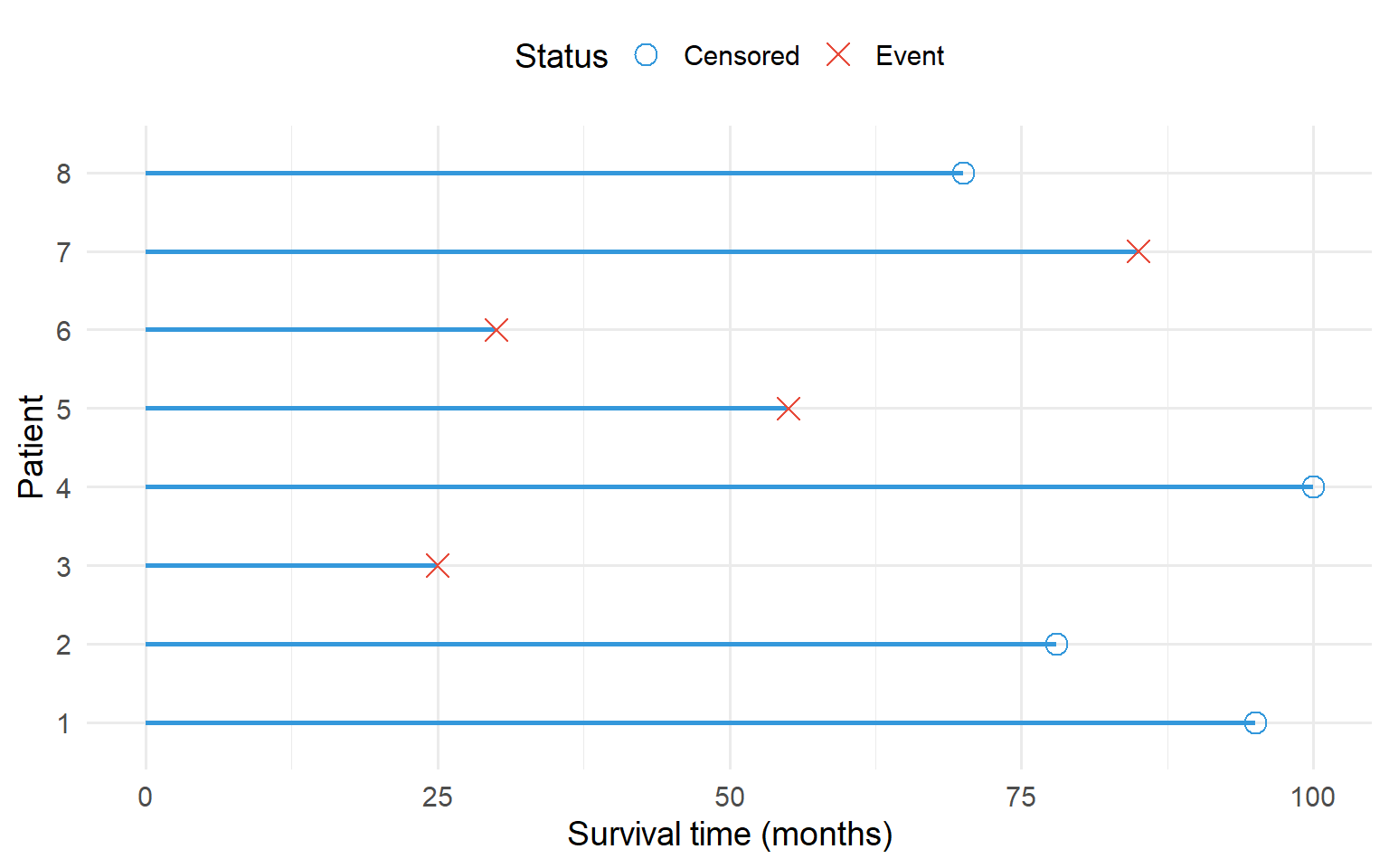
Figure 12.1: Schematic of a survival analysis study. Each line represents a subject. Circles indicate censored data, crosses indicate the event occurred.
A comparison of the mean time to reach the endpoint in patients can give misleading results because of censored data. Therefore, a number of statistical techniques, known as survival methods, have been developed to deal with these situations.
The aim of these techniques is to:
Statistically describe survival times
Compare survival over several therapy groups (the idea being the longer the survival times, the better the therapy)
Find relations between survival times and other prognostic variables (for example, age, stage, severity of disease)
12.3 Kaplan-Meier Survival Curves
Survival data can be displayed graphically in a Kaplan-Meier plot.
The vertical axis displays the proportion of patients remaining free of the endpoint at any time after baseline
Each event (death) is indicated by a step in the curve
Censored data are indicated by (+)
The resulting curve is therefore a series of steps, starting at a survival probability of 1 (or 100%) at time 0 and drops towards 0 as time increases
In effect it shows the proportion of people who are still at risk of experiencing the event, while the horizontal axis shows the time that the subjects were followed up for.
The plot can be used to:
Describe time-to-event in one group
Compare time-to-event among different groups (for example, by treatment, or sex)
code
# Create synthetic survival data similar to the brain metastases exampleset.seed(456)# WBRT - worst survival (median ~60 days)wbrt <-tibble(time =c(rexp(10, 1/60), runif(4, 30, 180)),status =c(rep(1, 10), rep(0, 4)),treatment ="WBRT")# SRS - better survival (median ~426 days)srs <-tibble(time =c(rexp(6, 1/400), runif(4, 200, 800)),status =c(rep(1, 6), rep(0, 4)),treatment ="SRS")# PBRT - best survival (median ~588 days)pbrt <-tibble(time =c(rexp(4, 1/550), runif(4, 300, 1000)),status =c(rep(1, 4), rep(0, 4)),treatment ="PBRT")surv_data <-bind_rows(wbrt, srs, pbrt)surv_data$treatment <-factor(surv_data$treatment, levels =c("WBRT", "SRS", "PBRT"))# Convert time to yearssurv_data$time_years <- surv_data$time /365# Fit survival curvesfit <-survfit(Surv(time_years, status) ~ treatment, data = surv_data)# Plotggsurvplot(fit, data = surv_data,palette =c("#e74c3c", "#3498db", "#27ae60"),risk.table =TRUE,pval =TRUE,conf.int =FALSE,xlab ="Time since end of radiotherapy (years)",ylab ="Percent alive (%)",legend.title ="Treatment",legend.labs =c("WBRT", "SRS", "PBRT"),surv.scale ="percent",break.time.by =1,ggtheme =theme_minimal(base_size =12))
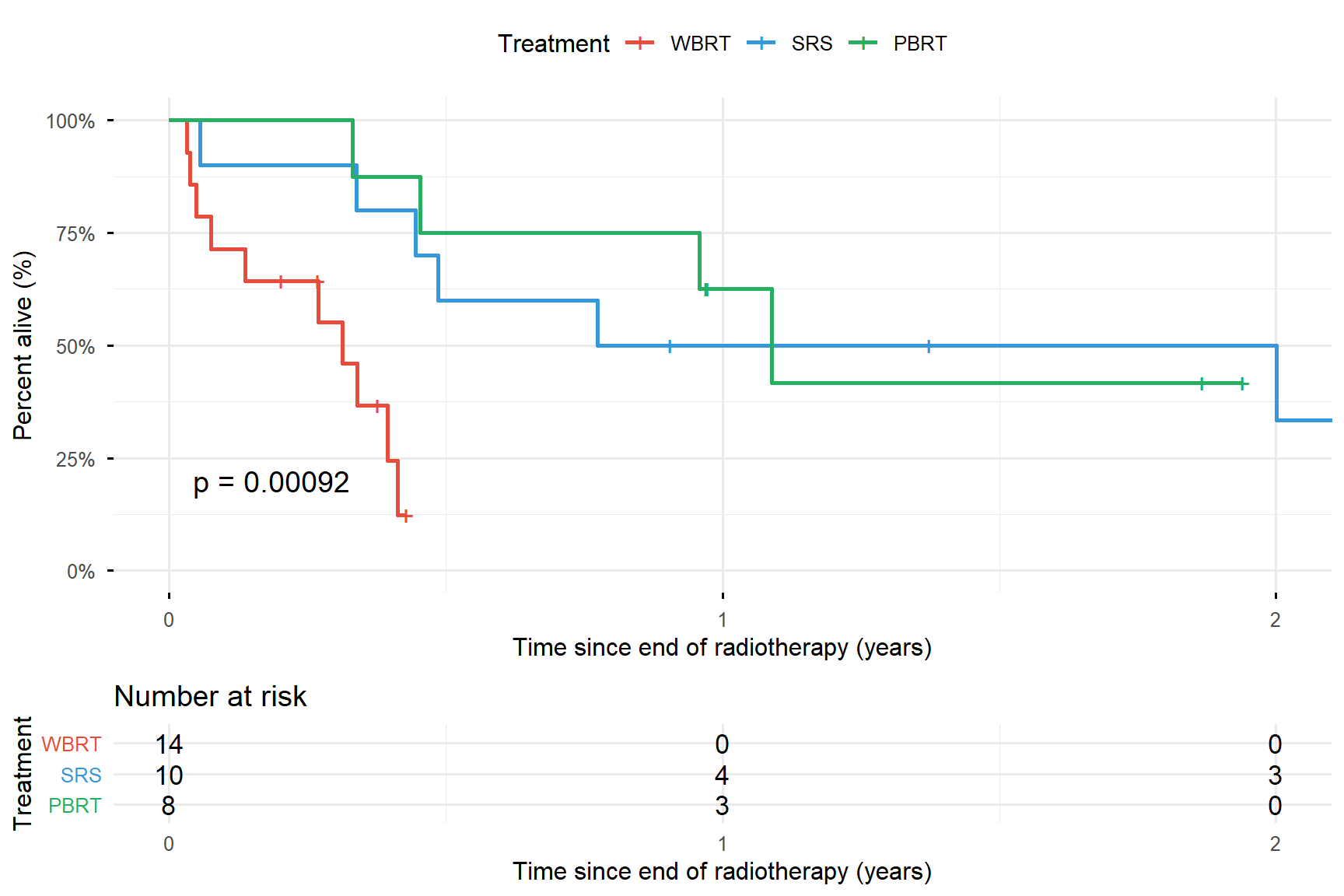
Figure 12.2: Kaplan-Meier curves for overall survival among renal cancer patients with brain metastases treated with different radiotherapy modalities
Interpreting Kaplan-Meier Curves
At the start of the study, no patients have died and the proportion at risk is 1.0 (100%). At each time point where a line drops, at least 1 patient experiences the event (death).
The dashed horizontal line at 50% indicates the median survival time in each treatment group. The median survival time is a useful summary measure that indicates the time at which 50% of patients have experienced the event.
12.4 Log-Rank Test
The most common (non-parametric) method of comparing survival between independent groups is the log-rank test.
The null hypothesis would be that the groups have equal median survival times (i.e. there is no difference in median survival between the groups). The alternative hypothesis is that at least one of the groups is different.
If the p-value is less than 0.05, the null hypothesis is rejected and we can conclude that there is evidence of at least one difference in the median survival times.
Extensions to the Log-Rank Test
Stratified log-rank test: Can adjust for categorical prognostic covariates (for example age group or sex)
Log-rank test for trend: Used for ordered groups (for example, cancer stage, or number of metastases). This is a more appropriate test for considering a trend in survival across the groups
12.5 Life Tables
Life tables describe survival data, where the results have been grouped into time intervals, often of equal length. This method is often described as actuarial.
The method of calculation is similar to the Kaplan-Meier method, but differences arise because of the lack of precision of recording of survival times. In general, the Kaplan-Meier analysis is recommended.
12.6 Cox Proportional Hazards Model
The log-rank test is solely a hypothesis test, comparing survival in two or more groups. It does not allow the relationships between one or more categorical or continuous factors and survival to be quantified.
To do this we employ the hazard rate (sometimes called the failure rate) which is closely related to survival curves. The hazard rate represents the risk of dying in a very short time interval after a given time t, assuming survival to time t.
We want to know whether there are any systematic differences between the hazards, over all time points, of individuals with different characteristics.
This can be achieved using the Cox proportional hazards model to test the independent effects of a number of explanatory variables on the hazard. The method assumes that the effect of a predictor on survival does not change over time.
Output from Cox Models
For each variable the Cox proportional hazards model produces an output which includes:
A hazard ratio with a confidence interval
A p-value
Interpreting Hazard Ratios
Hazard Ratio
Interpretation
> 1
Raised hazard, suggests shorter survival times. The hazard increases by 100 × (HR - 1)%
= 1
No increased or decreased hazard of the endpoint
< 1
Decreased hazard, suggests longer survival times. The hazard decreases by 100 × (1 - HR)%
The p-value relates to a significance test performed to test whether that hazard ratio is different from one.
Types of Predictors
For a continuous predictor: The hazard ratio describes what happens to the hazard as the predictor changes by 1 unit of measurement
For levels of a categorical predictor: The hazard ratio describes the relative difference in the hazard between a level and a chosen reference level
12.7 Worked Example: Brain Metastases in Renal Cancer
Using data from the brain metastases example, a proportional hazards model produces:
Table 12.1: Cox proportional hazards model output for brain metastases survival
Variable
Hazard Ratio
95% CI
P-value
Sex
Men (reference)
1
-
-
Women
1.33
0.24-2.36
0.54
Age (years)
1.02
0.97-1.08
0.40
Number of metastases
1 (reference)
1
-
-
2+
1.68
0.45-6.19
0.43
Treatment
SRS (reference)
1
-
-
WBRT
7.11
1.85-27.3
0.004
PBRT
0.75
0.23-2.36
0.62
Interpretation
Sex: The reference group is men. After accounting for age, treatment and number of brain metastases, the hazard for women is higher than the hazard for men by 33% (1.33 - 1). The p-value is greater than 0.05 and the confidence interval includes 1, so there is no evidence to suggest an association between sex and hazard in the wider population.
Age: Age is a continuous variable. After accounting for sex and treatment, increasing age is associated with increasing hazard. A one-year increase in age is associated with a 2% (1.02 - 1) increase in hazard. However, the p-value is above 0.05 and the confidence interval includes 1, so there is no evidence to suggest an association between age and hazard in the wider population.
Treatment: The treatment reference group is SRS.
WBRT: After accounting for age and sex, the hazard for WBRT is statistically significantly higher than the hazard for SRS. Hazard for WBRT patients is 611% (7.11 - 1) higher than for SRS. This increase is statistically significantly different from 0. In a wider population of similarly chosen patients, the increased hazard is likely to be between 85% and 2630%.
PBRT: For patients chosen to receive PBRT, the hazard is 25% (1 - 0.75) lower than SRS, but is not significantly different from 0.
12.8 Summary
Concept
Description
Survival analysis
Analysis of time-to-event data
Censoring
Incomplete follow-up (event not observed)
Kaplan-Meier curve
Graphical display of survival probability over time
Median survival
Time at which 50% of patients have experienced the event
Log-rank test
Non-parametric test comparing survival between groups